
The anatomy of a great darts shirt
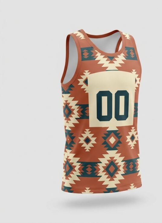
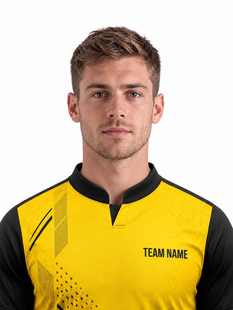
Pro darts shirts follow a formula: a bold base colour or panel structure, a personal motif (flames, lightning, geometry, a lucky number), the player's name or nickname across the back shoulders, and sponsor slots on chest and sleeves. Get those four layers right and the shirt works from any angle the camera catches.
Fit matters as much as graphics, darts shirts run relaxed through the body for comfort over a long night, with a longer back hem so nothing rides up mid-throw.
Motifs that work at a distance
Flames and smoke fades along the side panels read brilliantly on stage and in pub lighting. Geometric dart-flight patterns tile beautifully across sublimated fabric. Tributes work too: a subtle year, initials, or a nod to your home town. What doesn't work: tiny detailed illustrations, they disappear at ten feet.
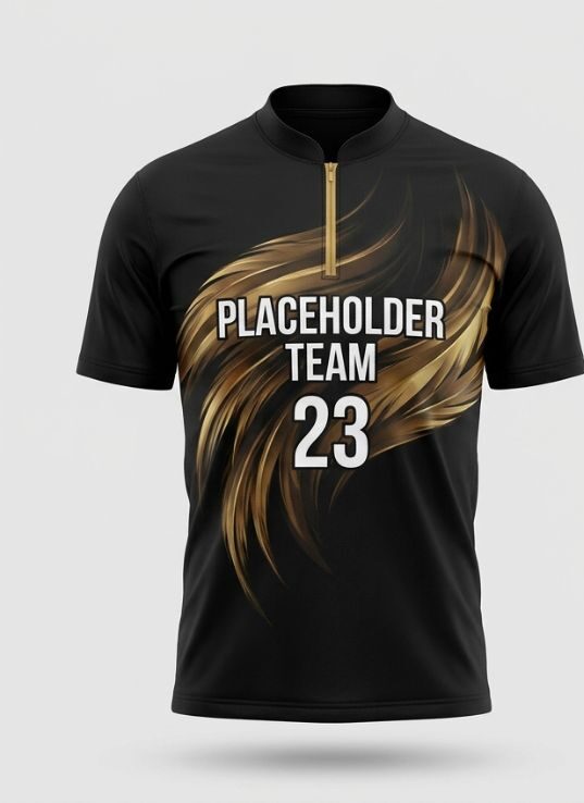
Colour psychology is real at the oche: black and gold reads champion, red reads aggression, electric blue reads modern TV-era pro.
Nickname typography
Your nickname is the headline, give it the back of the shirt in a condensed bold typeface, arched or straight, with a contrast outline so it pops against the base. Keep it under 14 characters if you can; 'THE HURRICANE' fits, a full sentence doesn't.
Front-left chest takes your first name or initials in the same type family. Consistency between front and back typography is what makes a shirt look professionally designed.
Sponsors without clutter
Pub and league sponsors fund the game, give them proper slots: centre chest primary, sleeves secondary, back-below-nickname tertiary. Because sponsors are sublimated with the design, adding five logos costs the same as adding one, but resist the airport-departure-board look: three sponsors max on the front.
From idea to shirt
Describe your idea on WhatsApp, colours, motif, nickname, and get a free mockup in 24 hours, or build it yourself in the darts shirt designer. One shirt or a whole league team, same process.